

This article includes links to and information from outside resources. We are not responsible for the content on the external site. If there is a link that does not work, please email [email protected] and we will attempt to adjust the information with an updated link.
We are so excited to partner with Salesforce because their releases help you, too! The Winter '25 release for Salesforce is currently rolling out, and below are some of the key enhancements we want to highlight as your Salesforce partner.
The Release Date for Winter '25 will depend on the instance of Salesforce, but the main release weekends are on:
-
September 06, 2024
-
October 05, 2024
-
October 12, 2024
If you already know the instance your production Org is located on, you can head over to Trust Status, click on your instance name, and hit “Maintenance”. This will show you the date of the Salesforce Winter '25 release hitting your Org. If you don’t know your instance, go to Setup > Company Information.
List Views
Get Better Performance for List Views on Custom and Standard Objects
To improve performance and meet the latest accessibility standards, list views for custom and standard objects now render with Lightning Web Components (LWC) instead of Aura. LWC, Salesforce’s newest framework, delivers data faster and makes the latest features available for custom list views. Previously, only custom object list views rendered with LWC, and only in sandboxes.
When: This update is available on a rolling basis starting in Winter ’25.
How: List view pages for standard objects include these changes, but overall, how users work in list views hasn’t changed.
-
The List Views dropdown menu displays up to 100 lists and shows Recent List Views and the option to search lists at the top of the dropdown. If there are more than 100 list views, use search terms to find a specific list.
-
Keyboard navigation for the List Views dropdown menu starts with the focus at the top of the list rather than on the currently pinned list.
-
Some icons and highlights have updated colors, such as the check mark next to a selected list in the List Views dropdown menu. Additionally, the color, size, alignment, and capitalization of some windows, buttons, and dropdown menus changed.
-
The Filters panel has new button options in the add or edit filters work flows: Cancel to exit the add or edit filter flow, and Save to apply your changes. When you add or edit a filter, the Value menu closes each time that you select an option from it. Options appear below the Value menu as you select them.
-
When users edit filter logic, the Cancel and Save buttons don’t appear in the Filters panel until you click outside of the Filter Logic text field. The filter logic is checked for errors when you save your changes.
-
When users create a filter that uses a location-based field, the values that you select initially show as the full location name in the Filters panel. After you save your changes, the values convert to an abbreviated form, such as
CAforCaliforniaorNVforNevada. -
After you add a filter, keyboard focus returns to the Add Filter button. After you edit a filter, keyboard focus returns to the edited filter.
-
Header icons in columns and fields don’t render.
-
Some errors and in-app messages appear in updated locations or formats and with new wording.
For example, after a save, a field-level error previously appeared directly below the affected input field. Now, a field-level error appears to the left of the row and includes the affected field’s name.
Some errors occur before you save. With this type of error, the error message appears below the input field in the edit panel, and the field reverts to its original value if you close the panel before you fix the issue.
-
If a lead record owner inline edits the record from a list view rendered with LWC, the record is considered read. The record’s Unread By Owner checkbox is unchecked. Previously, the Unread By Owner checkbox was unchecked only after the record owner viewed the full record.
-
You can inline edit encrypted text fields on an object.
-
Lookup fields render as hyperlinks.
Enhanced User List View: Make Inline Edits
Users can now view, sort, and filter user records in a list format and directly modify new entries inline. Quickly update and modify records and simplify this experience without navigating away from the list view. Salesforce delivered this feature as per the ideas on IdeaExchange.
How: From Setup>Quick Find Box: Users>User Management Settings. Enable Enhanced User List View. Select Users to view the enhanced page.
Enforce View Roles and Role Hierarchy Permission When Editing Public List View Visibility
If you don’t use roles, this update has no impact. With this update, only users with the View Roles and Role Hierarchy permission can see or select from your org’s list of roles when they edit public list view visibility. This update was first available in Spring ’24.
When: Salesforce enforces this update in Spring ’25. To get the major release upgrade date for your instance, go to Trust Status, search for your instance, and click the maintenance tab.
Why: This security update blocks users with only the Manage Public List Views permission from seeing roles and role hierarchies when they edit public list views.
How: To edit public list views, a user needs the Manage Public List Views permission. After you enable this update, to let users make list views visible to roles, also grant them the View Roles and Role Hierarchy permission. Alternatively, have a user who already has the View Roles and Role Hierarchy permission grant access to list views. A user with only the Manage Public List Views permission can still make a list view visible to Public Groups or set a list view to fully public or private.
To view this update, From Setup>Quick Find Box: Release Updates>Release Updates. For Enforce View Roles and Role Hierarchy Permission When Editing Public List View Visibility, follow the testing and activation steps.
Field Conditional Formatting
Use Conditional Formatting to Make Record Fields Stand Out
Apply formatting to fields to help users can quickly identify the most relevant information on a record page. In Lightning App Builder, give fields on Dynamic Forms-enabled pages custom icons and colors that can appear, disappear, and change color based on the criteria and rules that you define. The conditions can be based on the field's value or on the values of other fields on the page. Users can view, edit, and delete rulesets for an object with the new Conditional Field Formatting node in Object Manager. We delivered this feature thanks to your ideas on IdeaExchange.
When: This functionality is available on a rolling basis starting with pre-release and sandbox orgs in early September 2024.
How: Conditional formatting uses rulesets, which are collections of rules. Each rule is made up of conditions that determine how and when formatting appears on a field. To apply conditional formatting to a field, open a Dynamic Forms-enabled record page in the Lightning App Builder and click the field on the canvas. In the field's property panel, use the Conditional Formatting property to assign an existing ruleset or to create one.
For example, there is a Customer Sentiment field on a page with available values of Positive, Neutral, and Negative. Users can add conditional formatting to the field with rules configured to show a green happy-face icon when the field value is Positive, a yellow neutral face when the value is Neutral, and a red sad-face icon when the value is Negative. That way, viewers can instantly see the sentiment value based on the style and color of the icon.
Users and Permissions
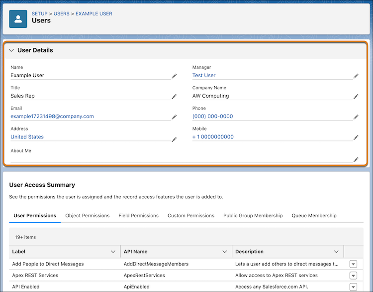
Manage Details About a User in One Place
User information is now consolidated on the improved User Access Summary page, so it’s easier to view and edit that information. The standard and custom user fields that appear on the summary page match the User Details section of the user’s assigned user profile page layout.
How: From Setup>Quick Find Box: Users> Users. Select a User>View Summary.
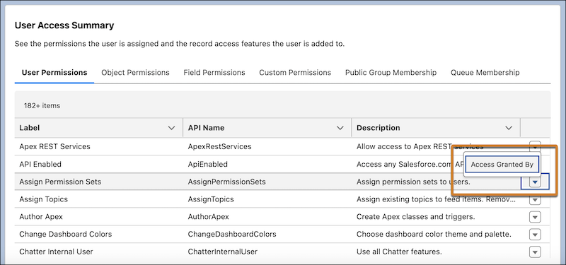
Get Insight into How a User’s Permissions Are Granted
To simplify user management, users now have visibility into the profile, permission sets, and permission set groups that grant permissions to a specific user. This information about a user’s assigned object, field, user, and custom permissions is available in the User Access Summary. Previously, troubleshooting where a user’s permissions came from required multiple queries or steps. Now users can get this information with a few clicks. Salesforce delivered this feature as per the ideas on IdeaExchange.
How: From Setup>Quick Find Box: Users>Users. Select a User>View Summary. To see how an individual permission was granted, click the row-level action, and then click Access Granted By.
See How Object Access Is Granted in Object Manager
Get a comprehensive view of the permission sets, permission set groups, and profiles that grant access to an object, and the level of access granted. Use the read-only Object Access Summary in Object Manager to quickly check object permissions when troubleshooting, completing reviews, or determining how to grant user access. We delivered this feature thanks to your ideas on IdeaExchange.
How: From Setup>Object Manager>Select an object. In the sidebar, click Object Access.

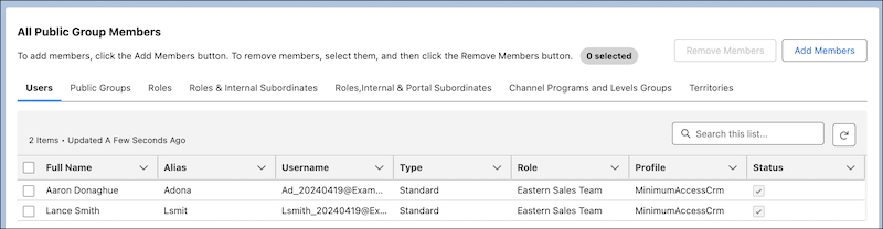
Manage Public Group Membership More Easily
Users can now use the public group’s summary page to manage public group members. The updated public group member selection experience has better performance and simplifies managing the included users, roles, and nested public groups. Users can search across all current or available members, add or remove up to 100 members at a time. Additionally, you can edit and delete the selected public group on its summary page.
How: From Setup>Quick Find Box: Public Groups>Public Groups. Select a Public Group>View Summary. Under All Public Group Members, add or remove members.
Add a Description for Public Groups
When users create or edit a public group, you can now include a brief description of its purpose or function. Salesforce delivered this feature as per the ideas on IdeaExchange.
How: From Setup>Quick Find Box: Public Groups>Public Groups. Create a new public group or choose an existing one. Then edit the Description field.
Supported Browsers and Devices
Consider these browser restrictions when working with Lightning Experience.
-
Salesforce doesn’t support nonbrowser applications that embed WebView or similar controls to render content for Lightning Experience. Examples of approaches that embed this type of control include Salesforce Mobile SDK, Microsoft’s WebBrowser Control, Electron’s embedded Chromium browser, iOS’s UIWebView and WKWebView, and Android’s WebView.
-
Lightning Experience doesn’t support incognito or other private browsing modes.
Desktop and Laptop Browsers
Salesforce supports these browsers. Make sure that your browsers are up to date. Other browsers or older versions of supported browsers aren’t guaranteed to support all features.
|
|
|
MICROSOFT EDGE (NON-CHROMIUM) |
|
|
|
|
|---|---|---|---|---|---|---|
|
Lightning Experience |
Not supported |
Not supported |
Supports latest stable browser version. Internet Explorer mode for Microsoft Edge Chromium isn’t supported. |
Supports latest stable browser version |
Supports latest stable browser version |
Supports latest stable browser version |
|
Experience Builder sites |
Not supported |
Not supported |
Supports latest stable browser version. Internet Explorer mode for Microsoft Edge Chromium isn’t supported. |
Supports latest stable browser version |
Supports latest stable browser version |
Supports latest stable browser version |
|
Special setup considerations? |
Not supported |
Not supported |
No |
No |
No |
No |
|
Limitations? |
No |
Tablet Browsers
Use Apple Safari on iPadOS (iOS 13.x or later). . Lightning Experience on iPad Safari doesn’t support portrait orientation and orientation switching. Use landscape orientation, and maximize your Safari browser to full width. To prevent the tablet from switching orientation, turn on the iPad rotation lock.
|
|
APPLE® SAFARI® |
GOOGLE CHROME™ |
OTHER BROWSERS |
SALESFORCE MOBILE APP |
|---|---|---|---|---|
|
iPadOS |
Supported |
Not supported |
Not supported |
Supported |
|
Android |
— |
Not supported |
Not supported |
Supported |
Salesforce treats touch-enabled laptops, including Microsoft Surface and Surface Pro devices, as laptops instead of tablets. Users can’t access the Salesforce mobile app on these devices. Users are redirected to the full site experience that’s enabled for them—Lightning Experience or Salesforce Classic. Only standard keyboard and mouse inputs are supported on these types of devices.
Phones
For the best experience, use the Salesforce mobile app.
Third-Party Browser Extensions and JavaScript Libraries
Before using a third-party browser extension or JavaScript library, Salesforce recommends that users check AppExchange for browser extensions and apps from Salesforce partners or the Component Reference for base components that match requirements.
Although some third-party browser extensions can personalize and enhance the Salesforce experience, it is not recommended to use browser extensions that manipulate the DOM. Using third-party browser extensions is at the user’s risk. Salesforce can’t prevent these extensions from accessing user’s Salesforce data, nor can it detect that there’s any attempt to access data. Additionally:
-
Browser extensions that insert or remove elements in the DOM can interfere with the stability of Lightning Experience and lead to unexpected behavior.
-
Browser extensions that don’t follow Salesforce security standards can fail to work properly in Lightning Experience.
-
The internal DOM structure of Lightning Experience can change in a future release, and compatibility with a third-party browser extension isn’t guaranteed.
To use a third-party JavaScript library with custom Lightning components, upload it first as a static resource. Use the JavaScript library by loading it in the component depending on which model that you’re using.
-
Lightning Web Components: Load a third-party JavaScript library via
lightning/platformResourceLoader -
Aura Components: Load a third-party JavaScript library via
ltng/require
General Updates
Create and Verify Your Default No-Reply Organization-Wide Email Address to Send Email
To comply with increased email security standards, all orgs must create and verify a Default No-reply address in Organization-Wide Email Address settings.
When: This update was introduced with Summer ’24 and Salesforce is scheduled to enforce it in Winter ’25.
Why: The verified Default No-Reply organization-wide email address is used to send emails from your org. This update allows increased accountability for email deliverability.
How: In order to comply with increased email security standards, some emails will fail to be sent when lacking a customer-defined Default No-Reply Organization-Wide Email Address.
For more info:
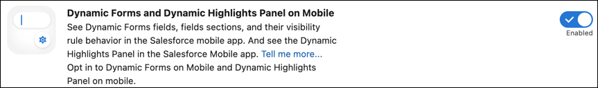
Enable Dynamic Highlights Panel and Dynamic Forms on Mobile with One Click
The option to enable Dynamic Forms on Mobile has been expanded to include the new Dynamic Highlights Panel on mobile devices. With one click, give your mobile users access to the same Dynamic Forms fields and Dynamic Highlights Panel that they see on desktop record pages.
How: From Setup>Quick Find Box: Mobile>Salesforce Mobile App.
Lightning App Builder
Configure Record Highlights in Lightning App Builder
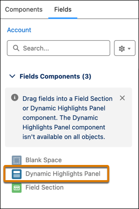
Use the new Dynamic Highlights Panel to configure the most important fields right in the Lightning App Builder. Previously, users could only configure fields in the Highlights Panel by using compact layouts in Setup. The Dynamic Highlights Panel can contain up to 12 fields. Salesforce delivered this feature as per the ideas on IdeaExchange.
How: Drag the Dynamic Highlights Panel component onto the Lightning App Builder canvas, and then add fields to it. The Primary Field value is preselected for users, but can be changed.
The Dynamic Highlights Panel is responsive. When users change the size of the browser window, the information stays visible and wraps instead of being truncated. Visibility rules can also be used to show and hide fields in the panel.
The Dynamic Highlights Panel is a container for fields just like a Field Section and can be found on the Fields tab in the Lightning App Builder.
Users can also customize the actions that appear in the panel. The Dynamic Highlights Panel uses dynamic actions by default and is supported for all LWC-enabled objects. For a list of LWC-enabled objects, see LWC Migration for Record Home Pages.
Users can see the Dynamic Highlights Panel immediately on desktop, but for it to appear on mobile record pages, it must be enabled from Setup>Salesforce Mobile App>Dynamic Forms and Dynamic Highlights Panel on Mobile.
Flow Builder
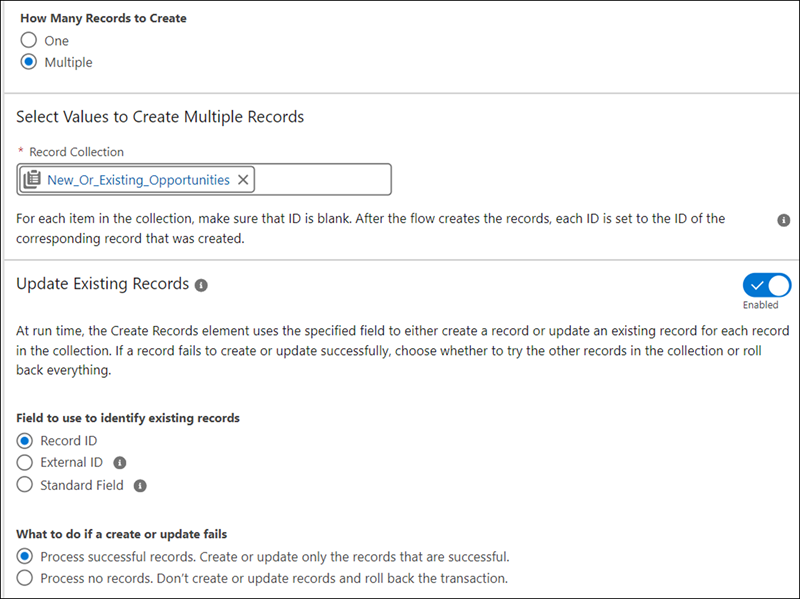
Create or Update Records Efficiently with the Create Records Element
In Flow Builder, users can now use the Create Records element to create or update records based on whether a specified field value exists in the database. The Create Records element makes the process of saving records easier and faster, as you no longer check separately for existing records. By merging create and update into one element, you configure and maintain the flow more easily while reducing potential errors from separate operations.
How: Imagine a sales manager who manages potential sales deals that are frequently updated with new information. For instance, a sales team receives periodic updates about client budgets and timelines that are reflected in Salesforce. The team can use the Create Records element to automatically decide whether to create a record or update an existing one.
From Flow Builder, add the Create Records element. For How Many Records to Create, click Multiple and select a record collection. Enable Update Existing Records. Then select the remaining options for identifying existing records and for processing the remaining records in case a record fails.
Transform Data into More Target Resource Types
With the Transform element, users can now set the target resource to primitive data types, such as Text, Numbers, Currency, Boolean, Date, and Date/Time. Previously, the Transform element’s target resource only supported complex data types, such as Record or Apex-defined.
How: Modify small or large datasets in a way that’s easier to work with. For example, a sales manager wants to quickly see the total value of all open opportunities to forecast revenue. By using Flow Builder, you create a flow that retrieves the opportunities and stores them in a number variable that you can reference later in the flow.
The flow executes the Get Records element to retrieve a collection of all open opportunities. Next, the Transform element’s Source Data is set to the opportunity collection. The Target Resource is set to the Number data type.
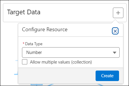
The Transform element calculates the number of open opportunities and stores the target output in a number variable.
Flow Builder - User Experience Updates
Identify Inefficient Flow Designs with New Tips
New tips in Flow Builder help users identify designs that can slow down the flows and increase the risk of reaching Apex governor limits. These tips appear in the Flow Builder canvas and provide guidance on how to improve your flow. By addressing these suggestions, you can ensure that your flows are running efficiently and avoid potential performance issues.
Why: These tips are especially useful for users who are new to building flows and aren’t aware of common pitfalls.
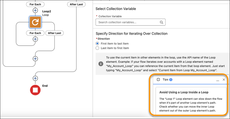
With these tips, users can proactively optimize your flows and improve the overall user experience. Additionally, the tips help reduce the need for troubleshooting and debugging, saving time and effort in the long run. Take advantage of these new tips to speed up your flows and achieve better results.
Troubleshoot Configuration Issues Systematically with the Errors and Warning Pane
Troubleshooting flow errors is easier than ever before. The new Errors and Warnings pane lists issues that prevent you from saving and activating your flow as you work in an easy to scan format. The pane includes links to the Flow Builder canvas that help you identify the source of issues. Users can show or hide the new pane with the Show Error button, which includes a notification badge that displays the total number of issues to address.
How: Create a flow, and click the Show Error icon in the button bar.

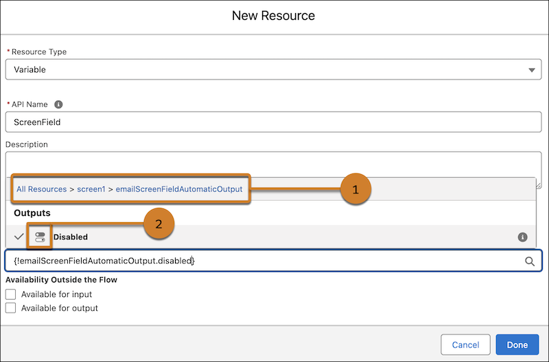
Create New Variable and Constant Flow Resources More Easily
Now it’s easier to create new variable and constant flow resources with improved grouping and user-friendly labeling. Resource grouping is now enabled for Text, Number, Currency, Boolean, Date, and Date/Time data types. These improvements make it easier for you to more quickly discover the resources that you need.
How: Open an existing or a new flow in Flow Builder and then click New Resource under the Manager panel. Select the resource type, Variable or Constant, and then the data type. Click in the Default Value field and enter a value or search for resources. The clickable breadcrumb path helps you identify where you are and navigate resource groups (1). You can recognize resource types quickly with more intuitive icons (2).
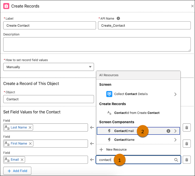
Find Flow Child Resources More Easily
When referencing the child resource of an element in a flow, such as a screen component within a Screen element, now users can search for and select it directly in the updated resource menu. Previously, users had to first select the element of the child resource, and then select the child resource. This change applies to these child resources: Screen components, screen actions, Decision element outcomes, and Wait element configurations.
How: For example, if users have a screen flow that collects a first name, last name, and email, and then creates a contact with that information. In the Create Records element following the Screen element, when you set the email for the new contact, search for the name of your email screen component (1). Then select the screen component (2).
Flow Testing and Debugging
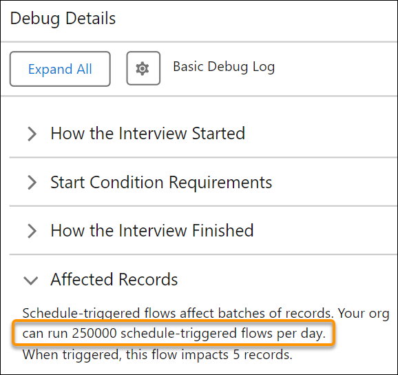
See Scheduled Flows Limit in Debug Details
Now, users can view the maximum number of scheduled flows that your org can run daily, helping you stay under the limits. Previously, the panel showed only the ID of the record on which the debug operation ran and the number of records impacted. This additional information helps users to plan and execute more efficiently, avoiding the frustration of halted flows.
Why: Understanding your daily limits upfront supports better resource management and operational planning. For instance, if you’re managing end-of-month reporting flows, you can adjust schedules to stay within limits, ensuring smooth and uninterrupted flows. Seeing the scheduled flows limit can be transformative for large organizations where flow limits can quickly become a bottleneck.
Flow Actions
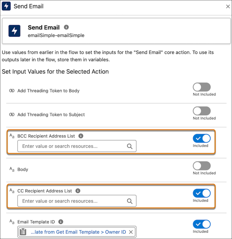
Expand Email Reach by Using CC and BCC Options in Send Email Action
The maximum total number of recipient email addresses is increased from 5 to 150. Users can now add CC and BCC recipients to emails by using the Send Email Action in Flow Builder. Any address entered in the CC field receives a copy of the email, and those in the BCC field also receive a copy, but their email addresses are hidden from all recipients.
How: In Flow Builder, in the element menu, search for Send Email, and then select Send Email. When you set input values, turn on BCC Recipient Address List and CC Recipient Address List. If you want to add recipients’ email addresses, enter them as a comma-delimited list or use a merge field that returns text in this format.